SOUTHWESTERN UNIVERSITY PIRATES REBRAND
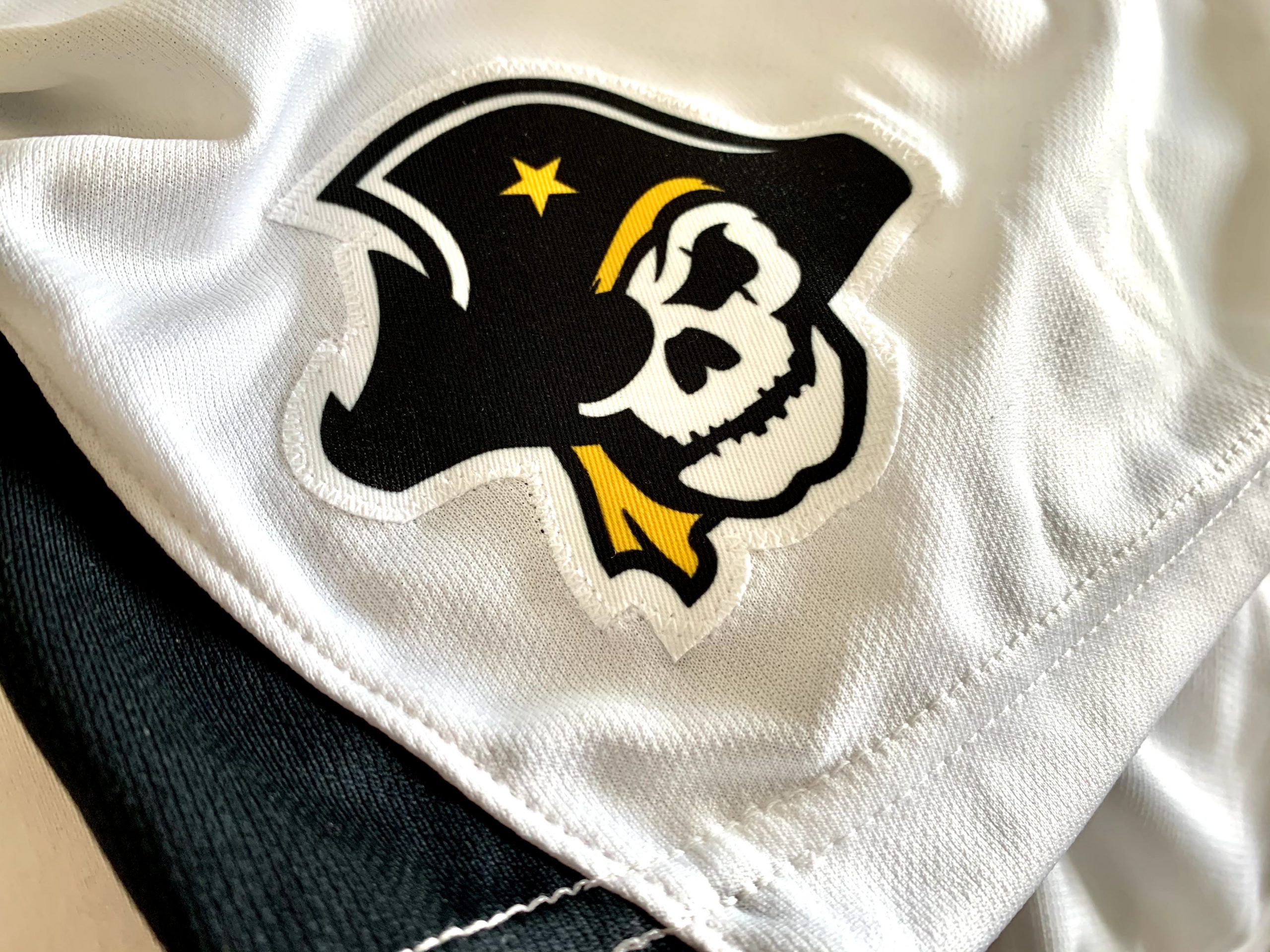
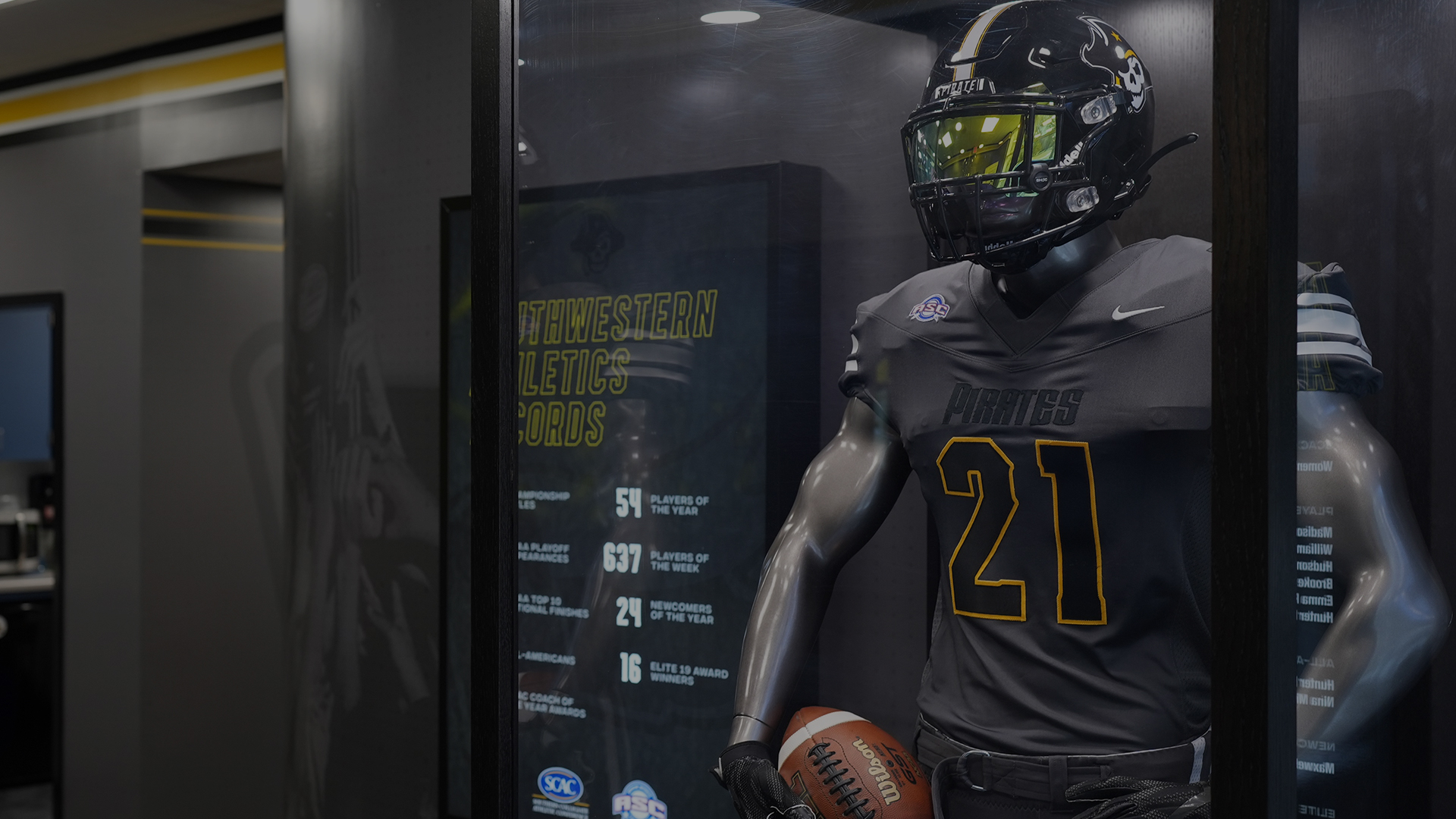
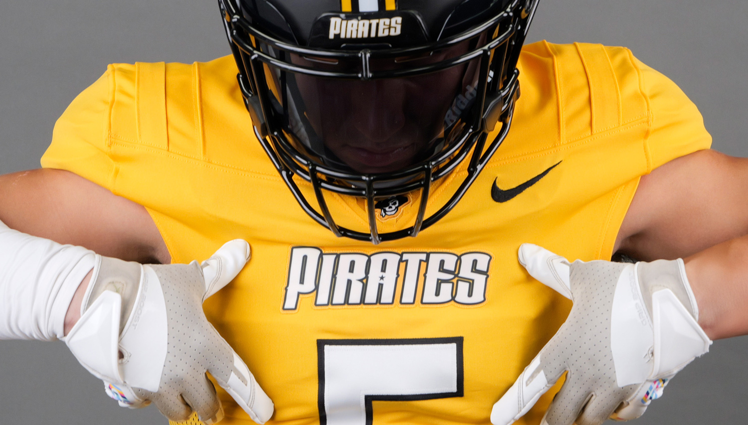
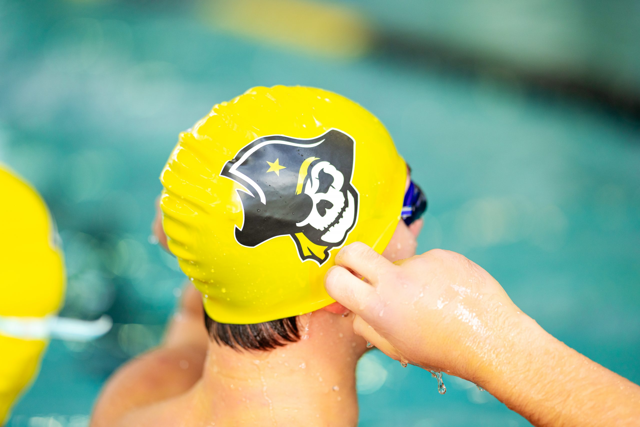
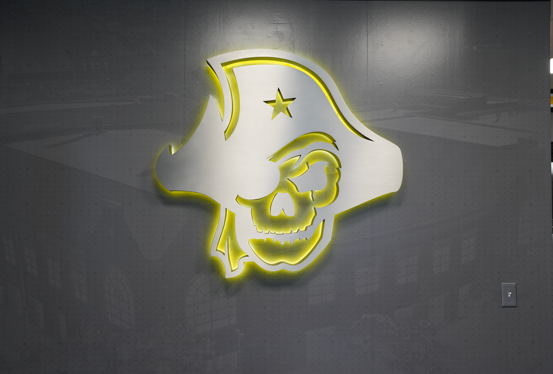
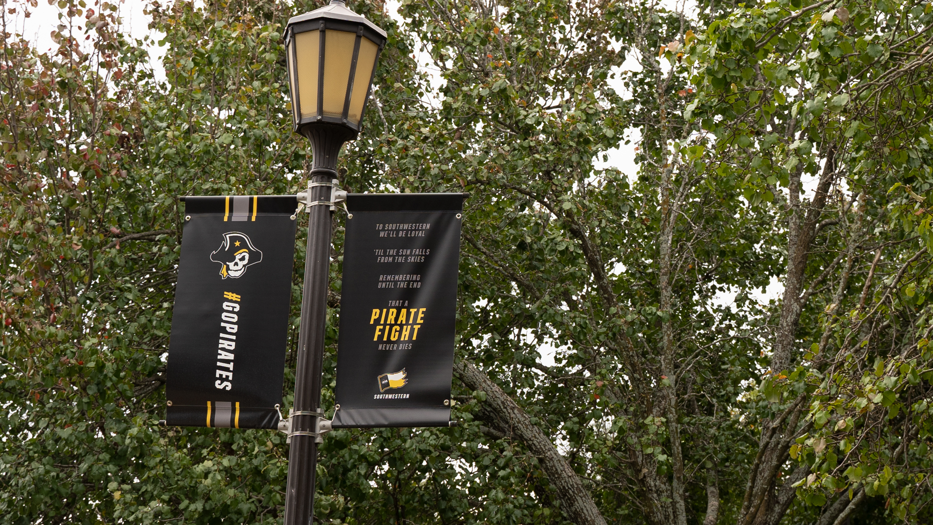
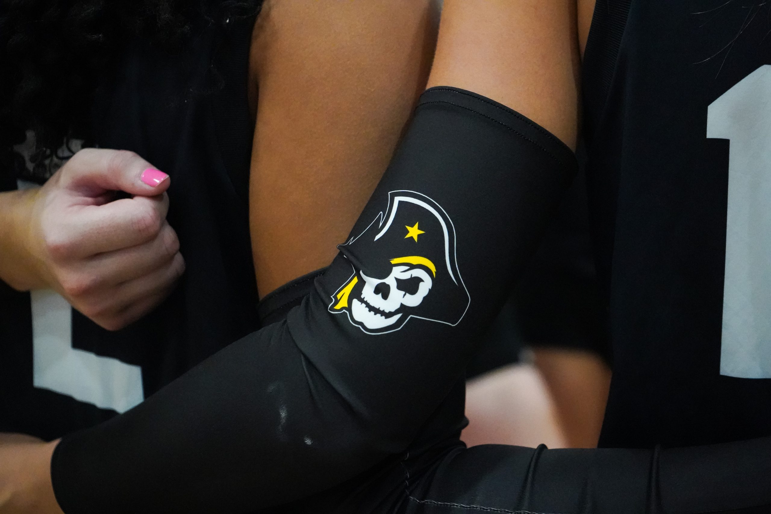
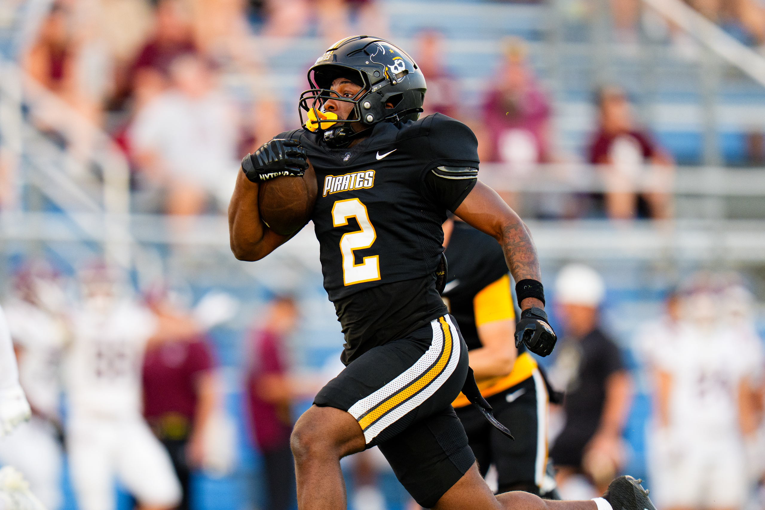
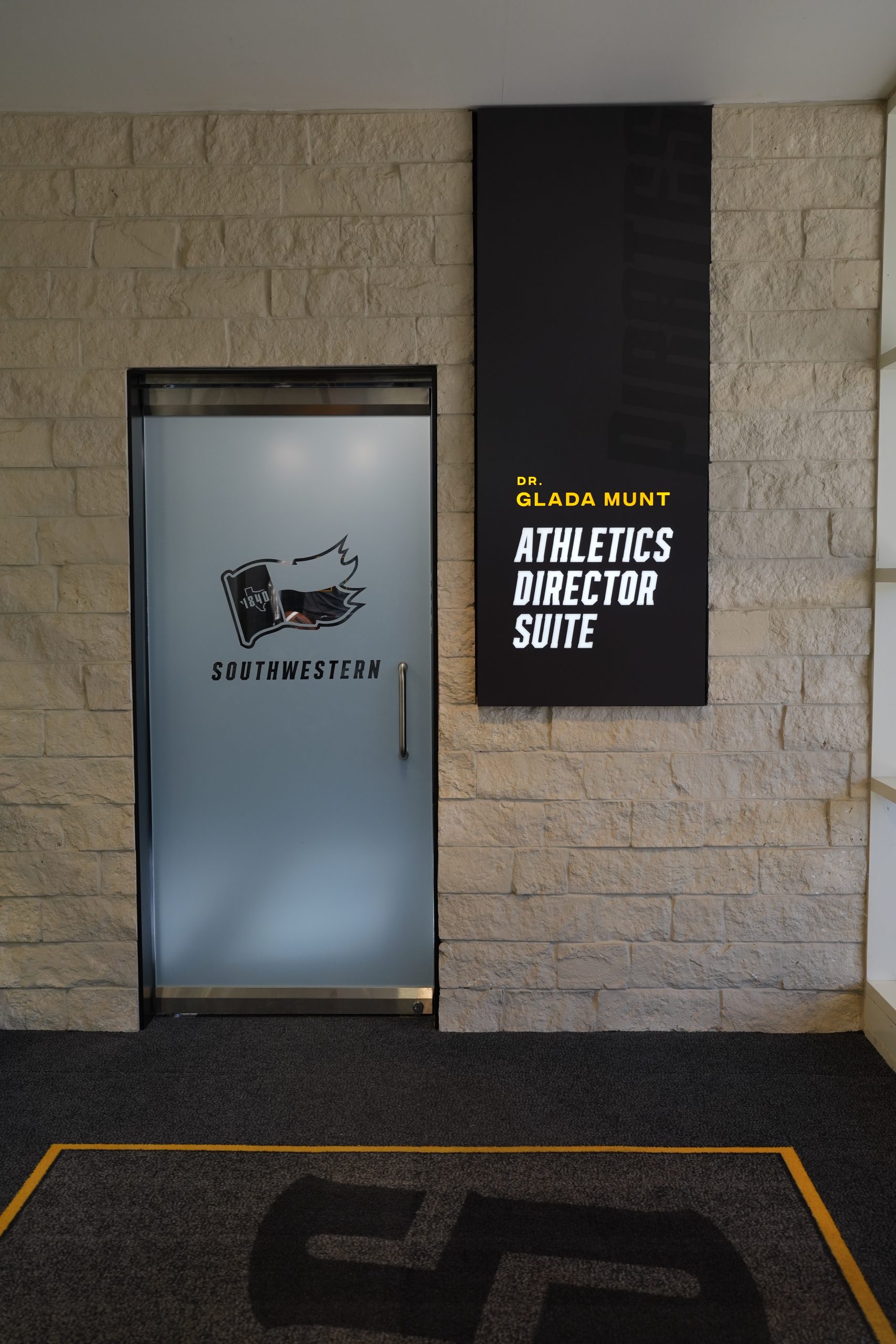
The Southwestern Pirates represent Southwestern University’s Division III athletics. As the first university in Texas, SU has a deep history, but its logos lacked pride, spirit, and consistency. Pirate imagery had nearly disappeared, leaving behind a confusing mix of outdated marks with little authenticity or investment. A true redesign was overdue.
Passionate about sports branding, I jumped at the chance when a student-athlete approached our department for help on a grad school project involving an athletics logo redesign. We started from scratch, focusing on what makes Southwestern unique and embracing its Pirate identity. The new marks honor the school’s heritage while working across a wide range of applications. Approved in 2021, the system is bold, modern, and intimidating—restoring pride in the Pirate name and strengthening the Southwestern athletics brand for years to come.
Client:
Southwestern University Athletics
Services:
Branding, Apparel, Environmental & Interior
Location:
Georgetown, TX
Primary Mark
Secondary Mark
Tertiary Mark
Logotype
Logo History
Initial concept sketches
"Matt's creativity and eye for style has created innovation and impactful pieces we use on a daily basis. He's always available for consultation and turns things around quickly. We are fortunate to have him on our team."
Ken Ralph
Director of Intercollegiate Athletics, Southwestern University Pirates