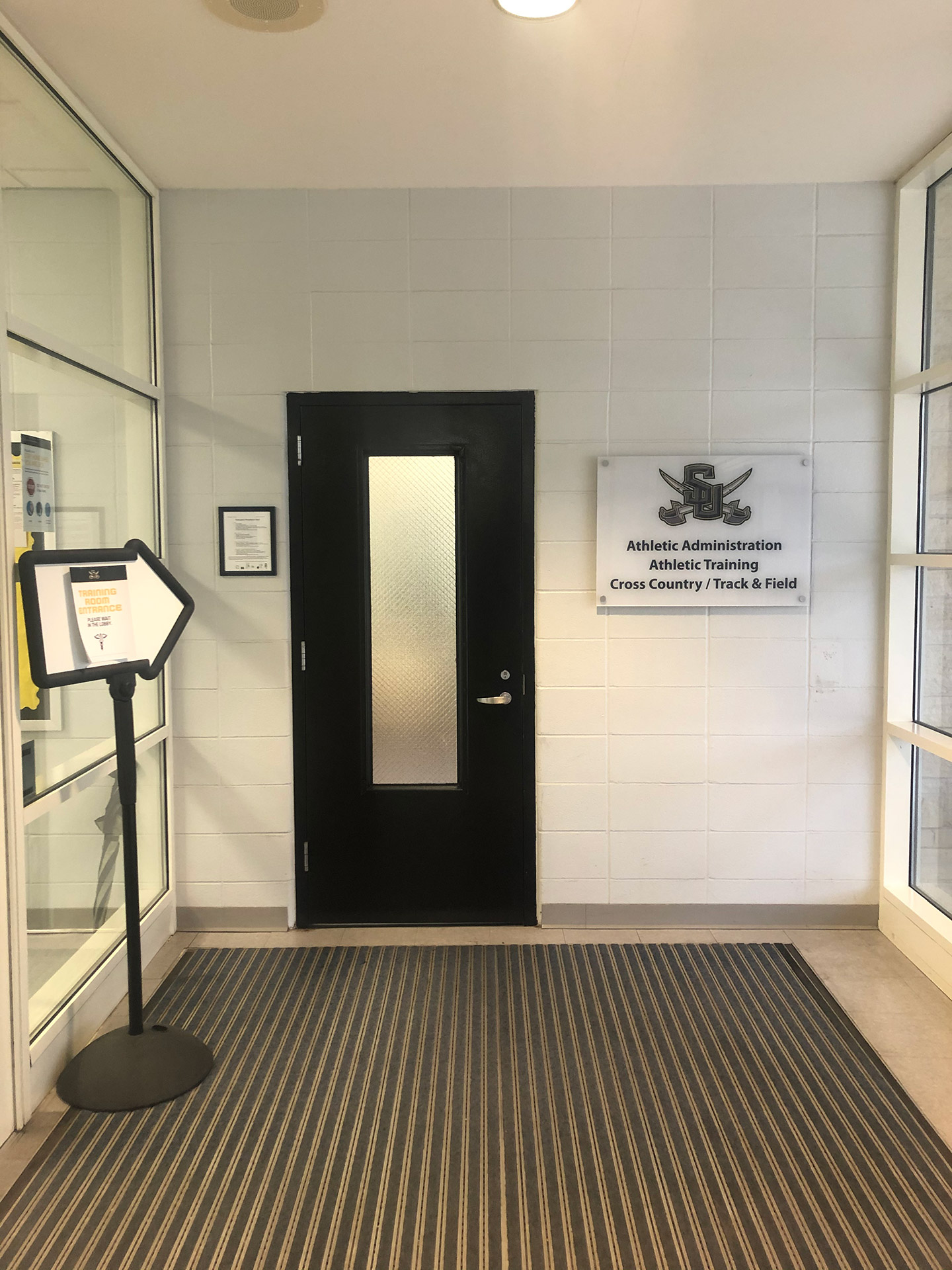
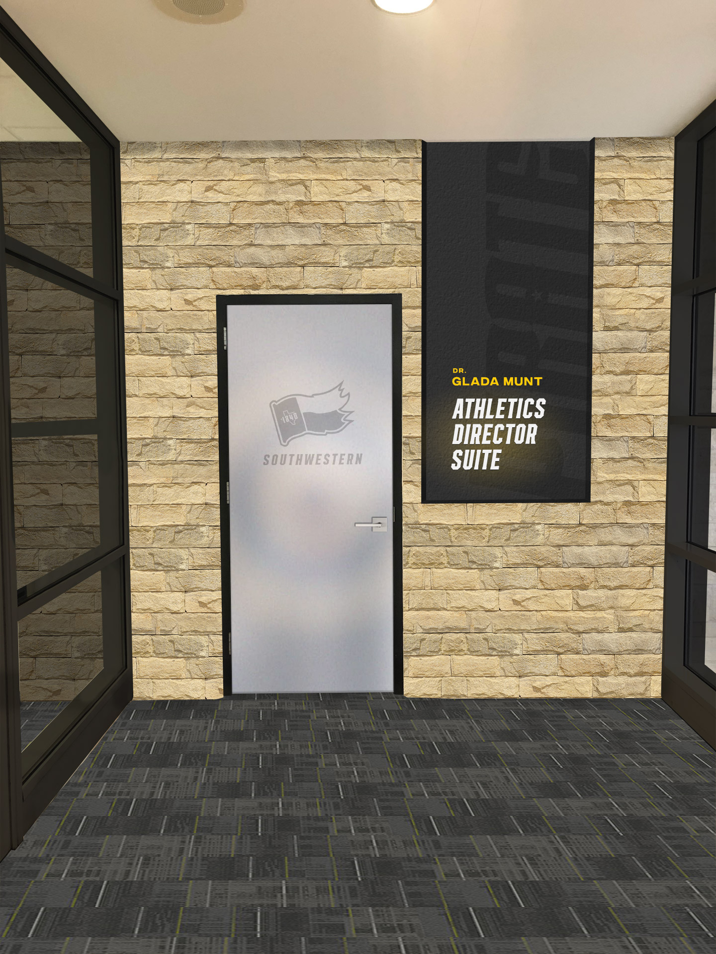
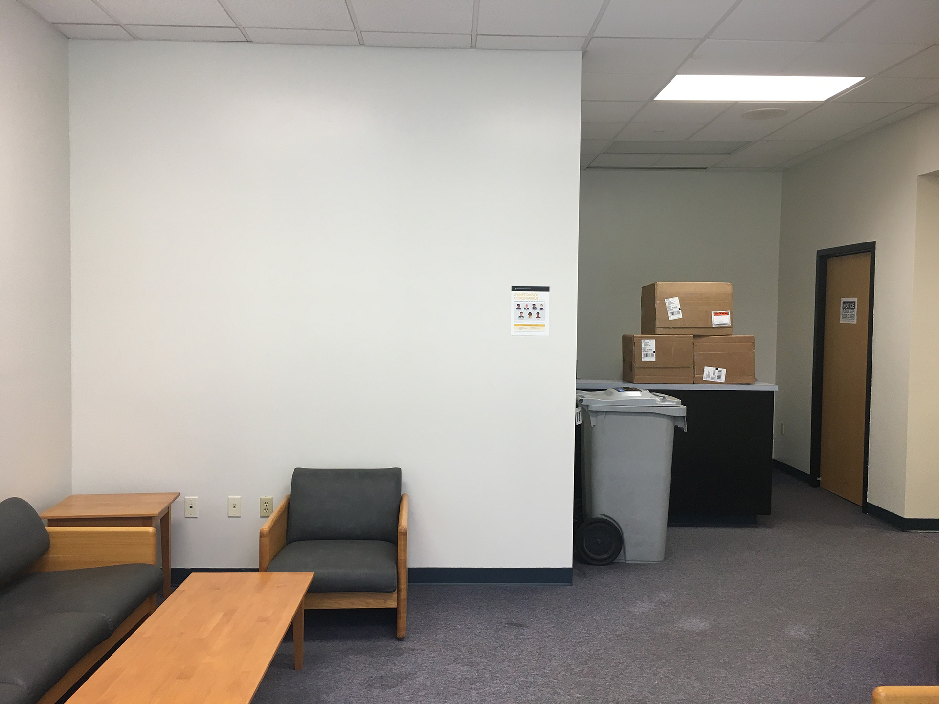
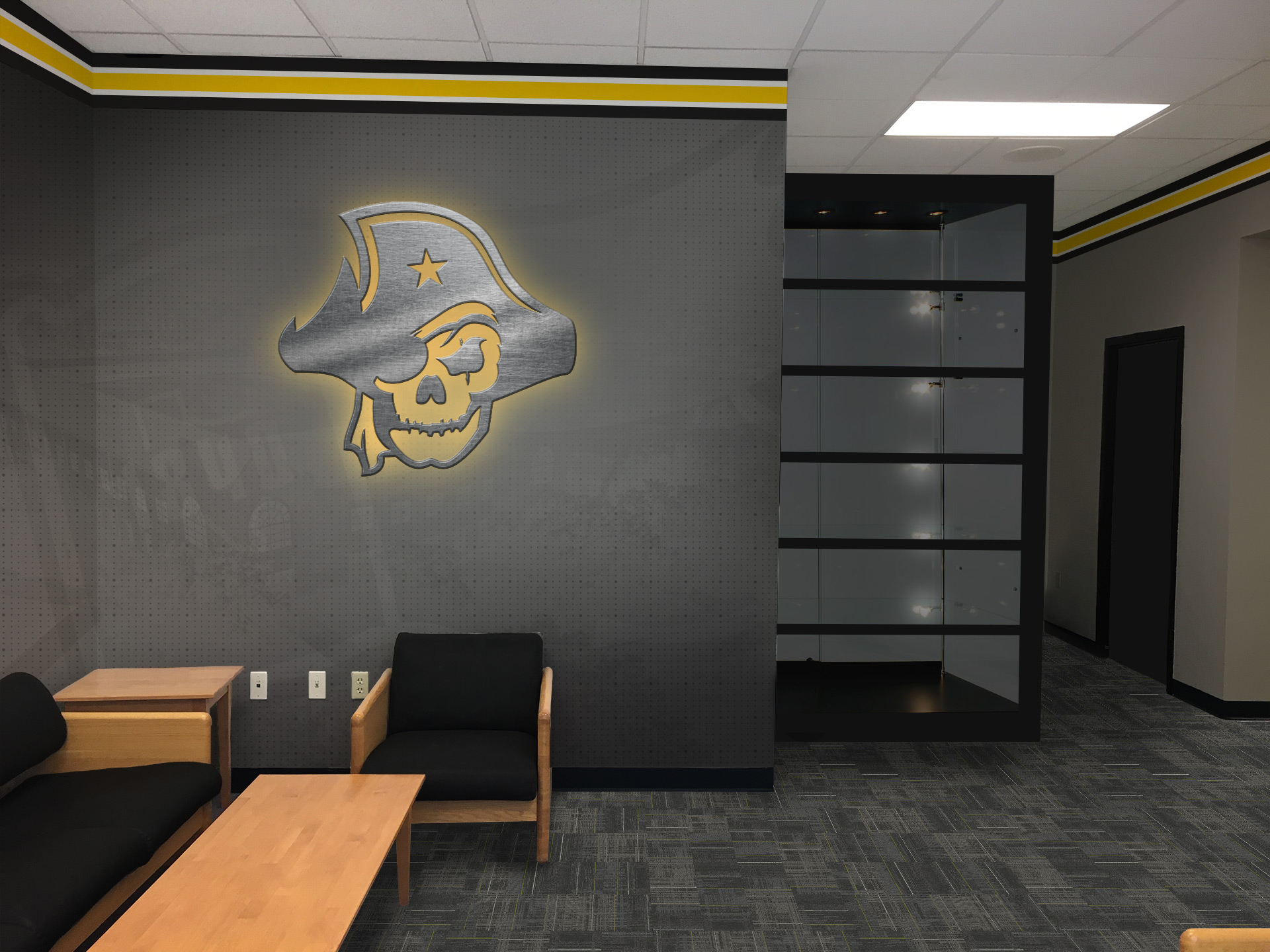
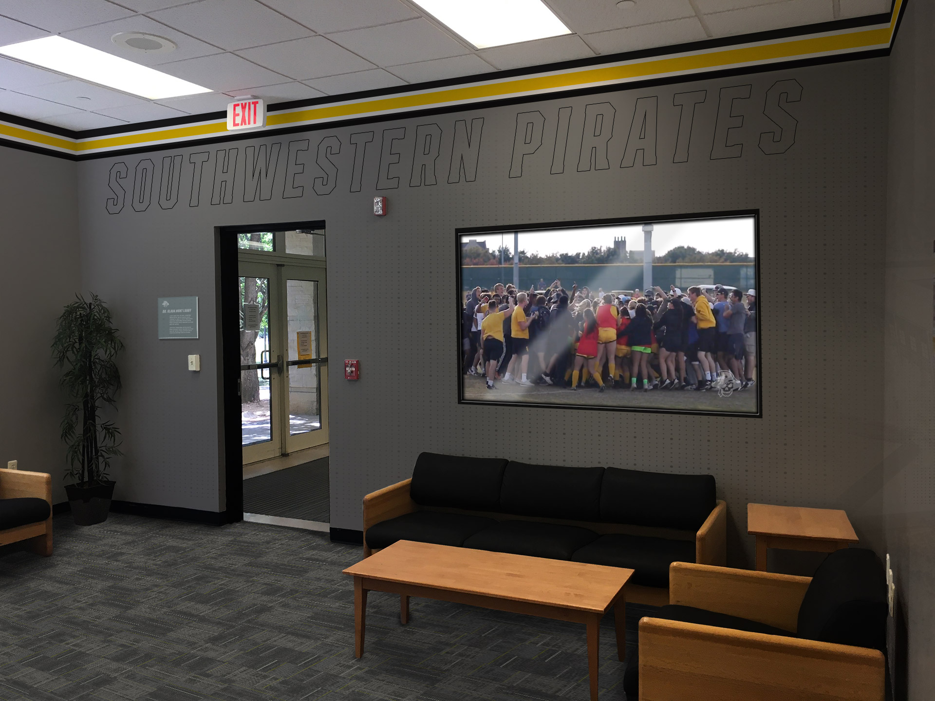
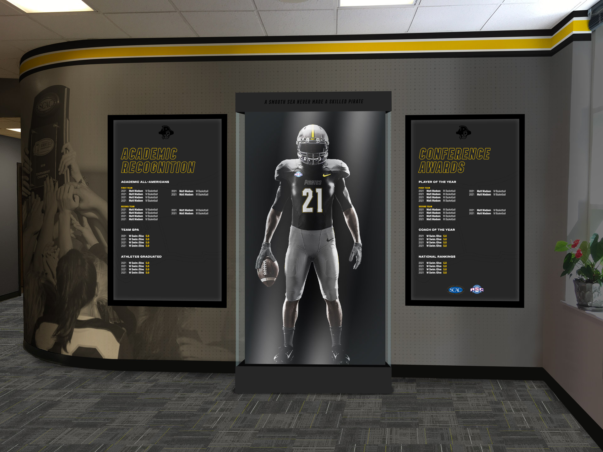
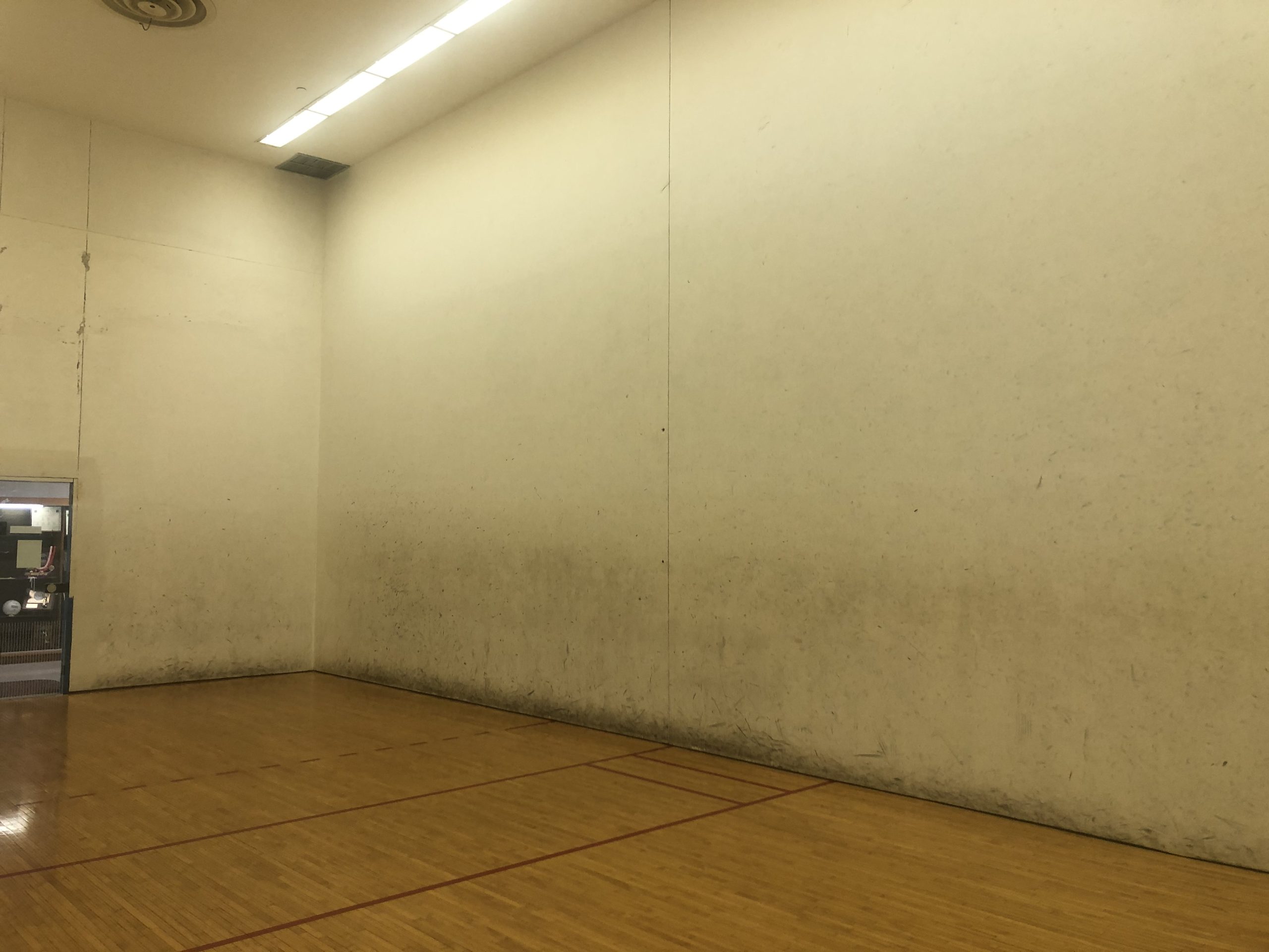
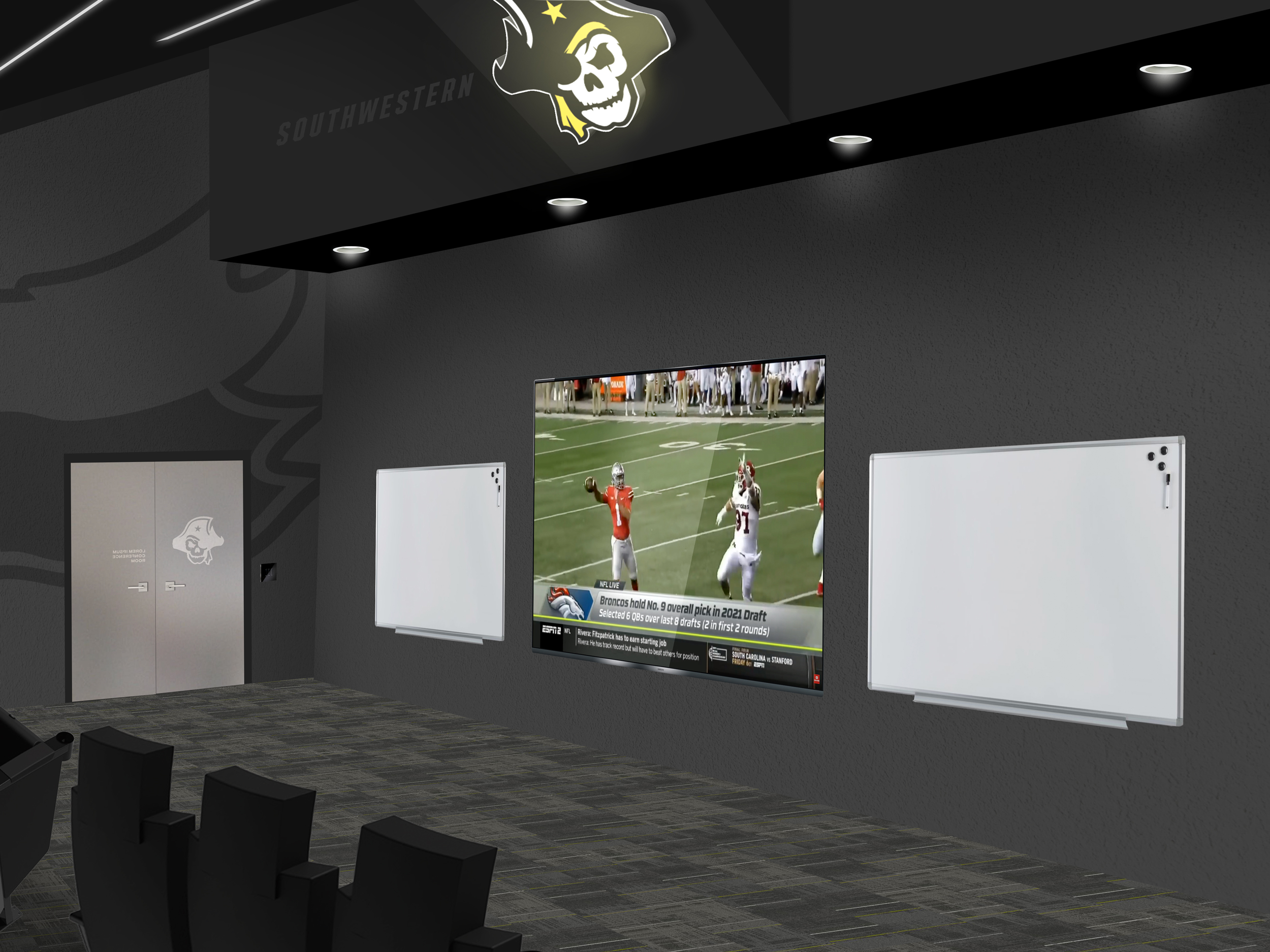
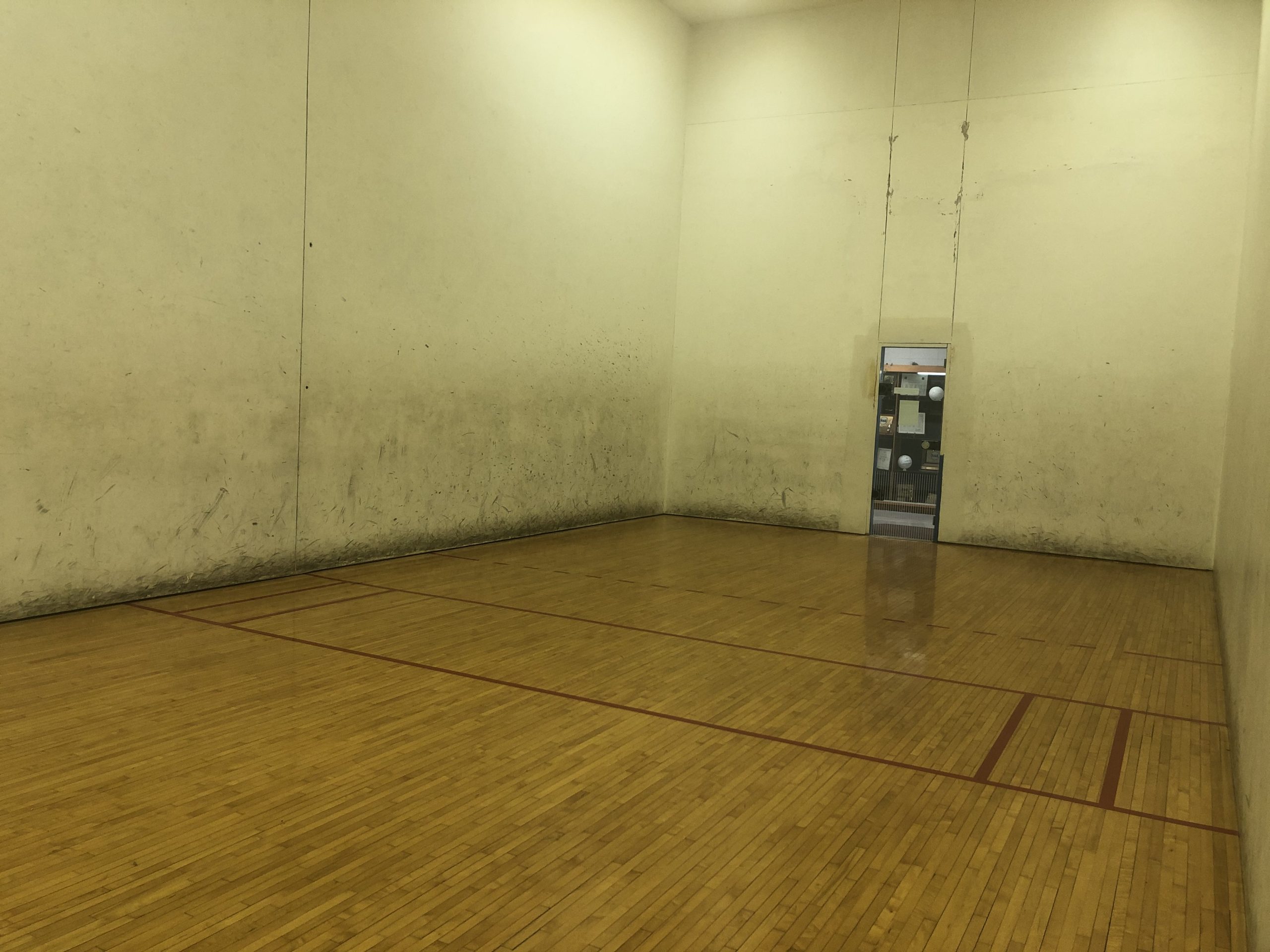
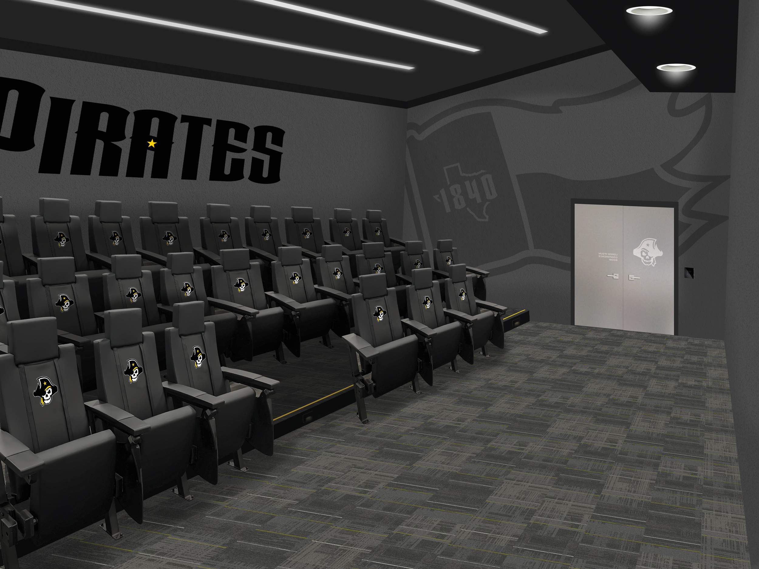
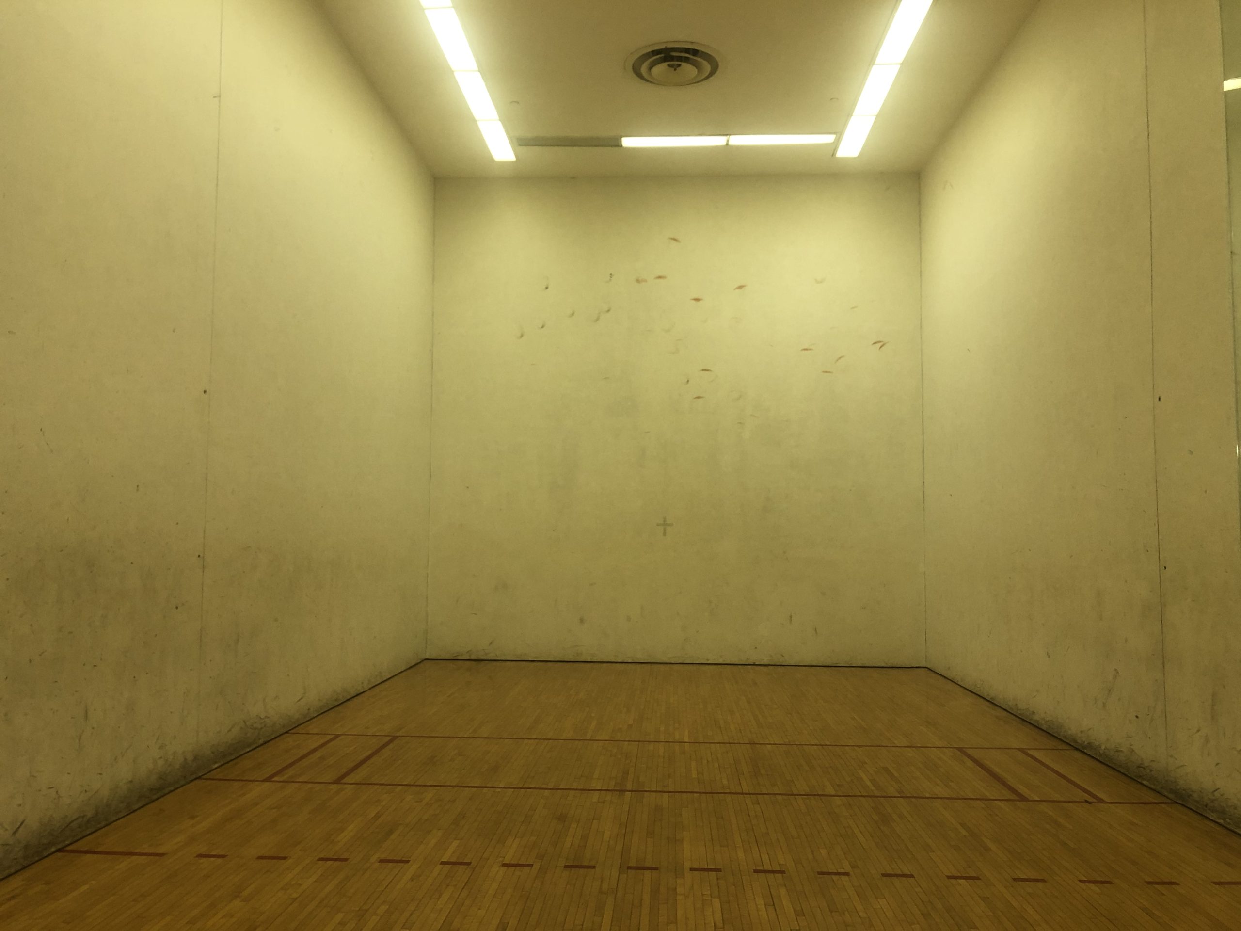
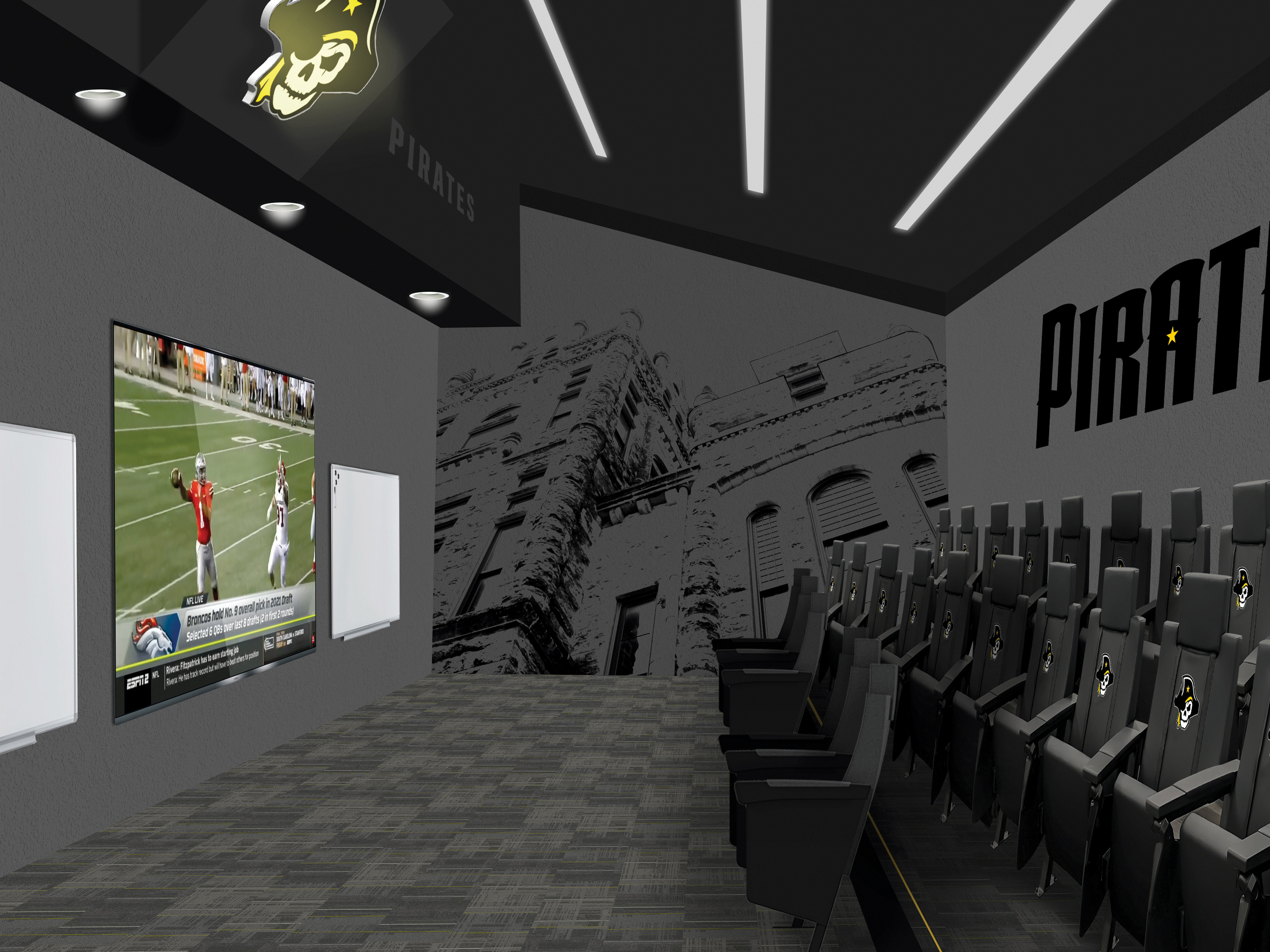
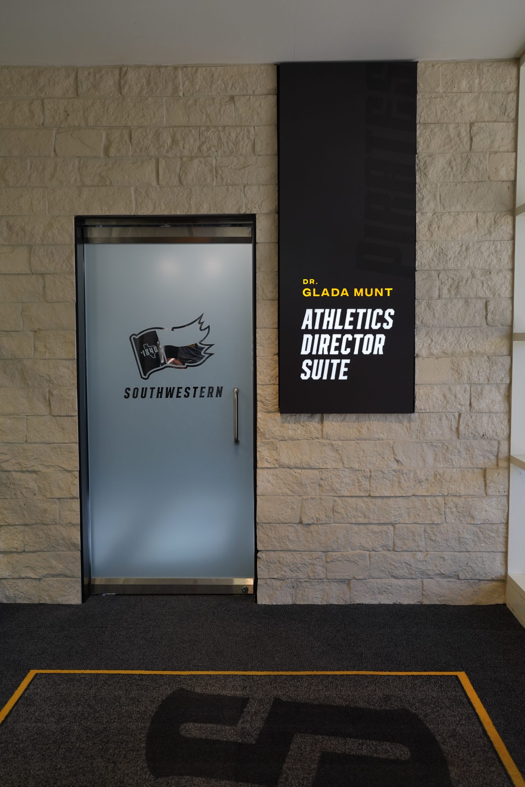
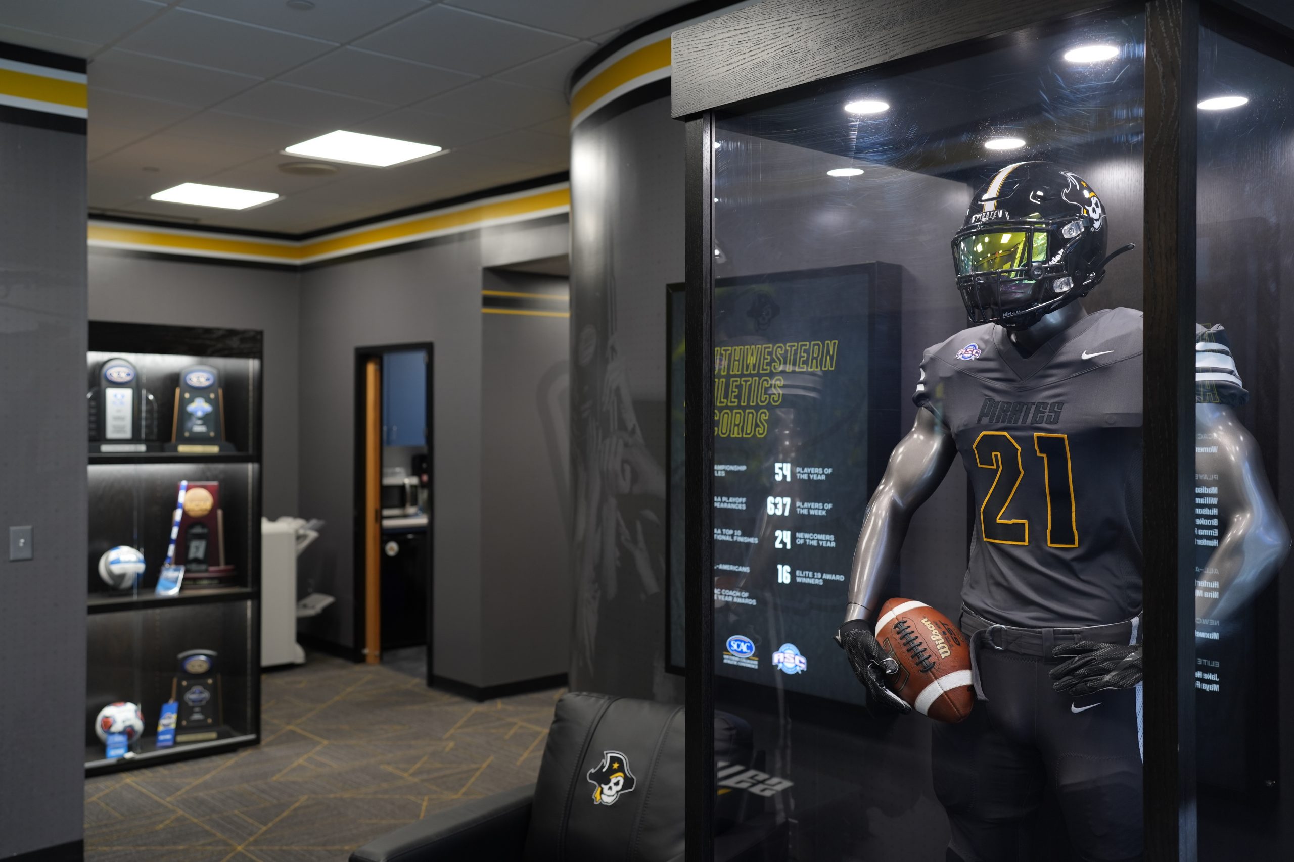
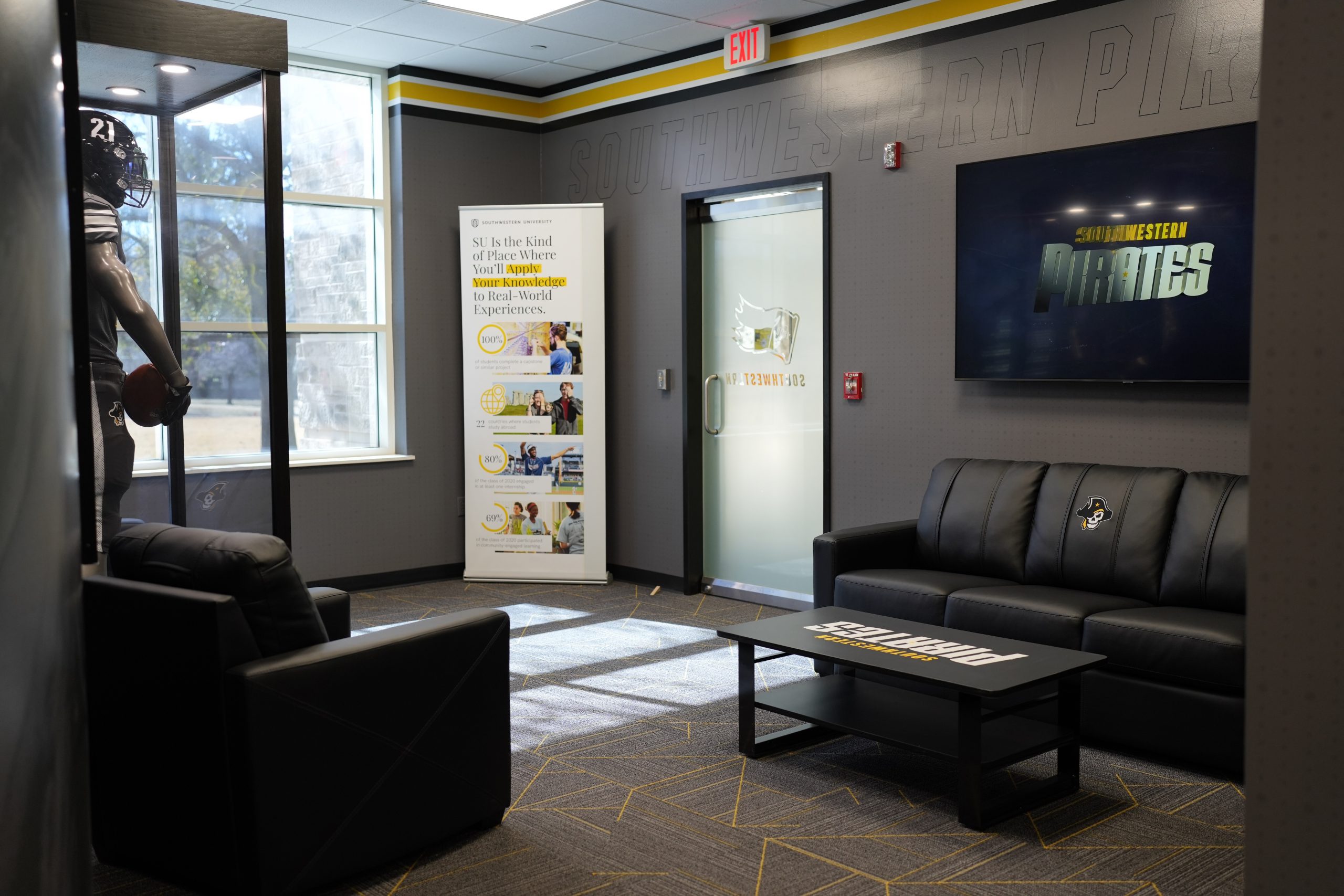
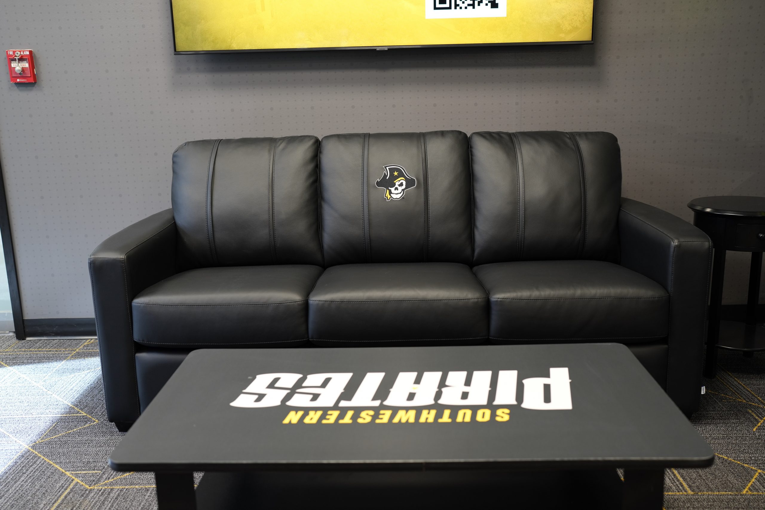
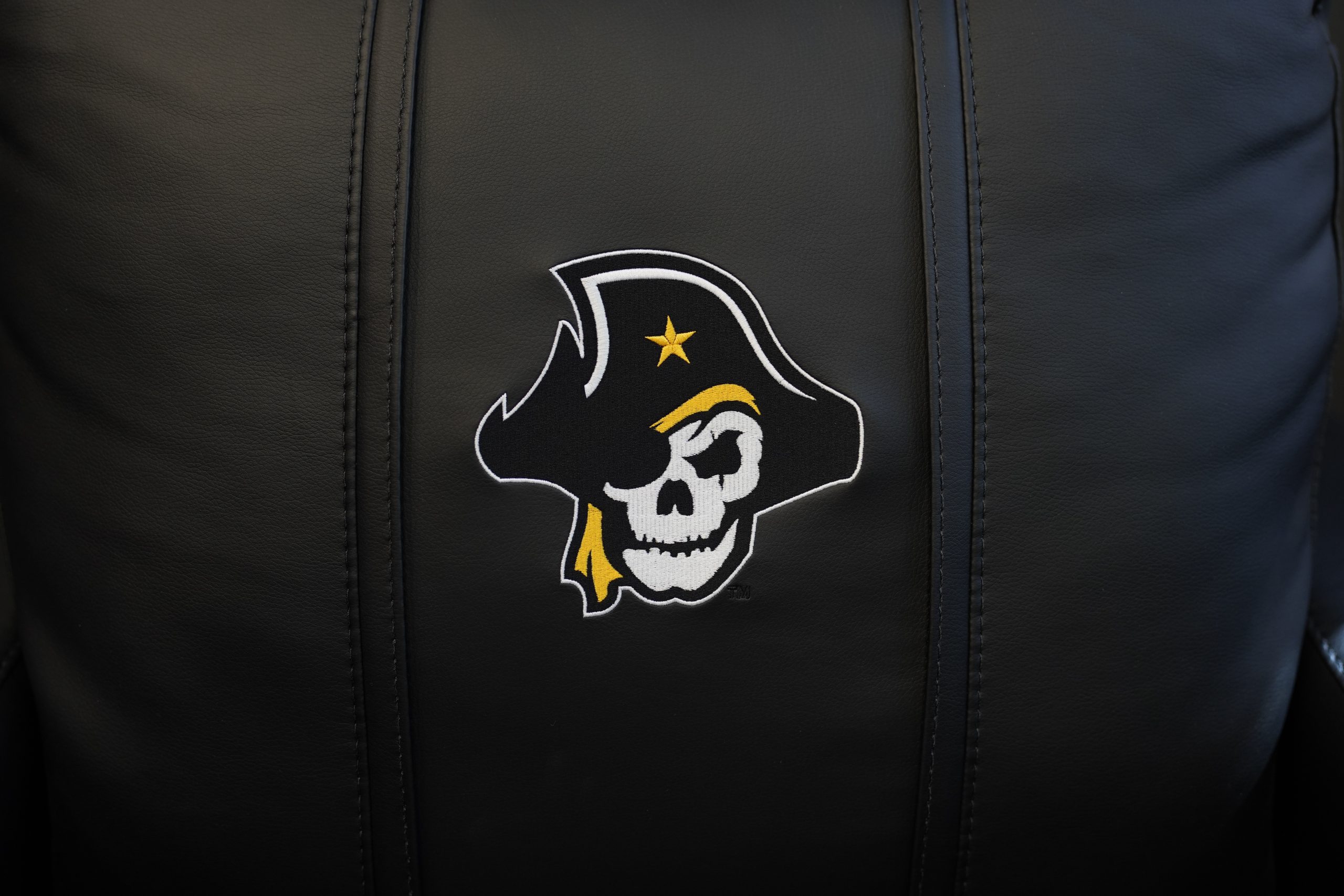
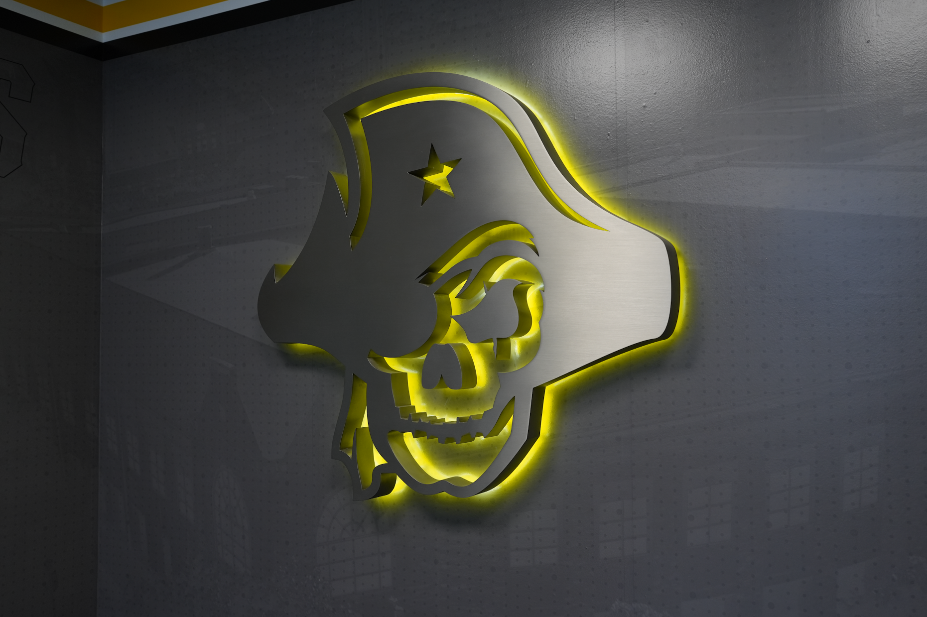
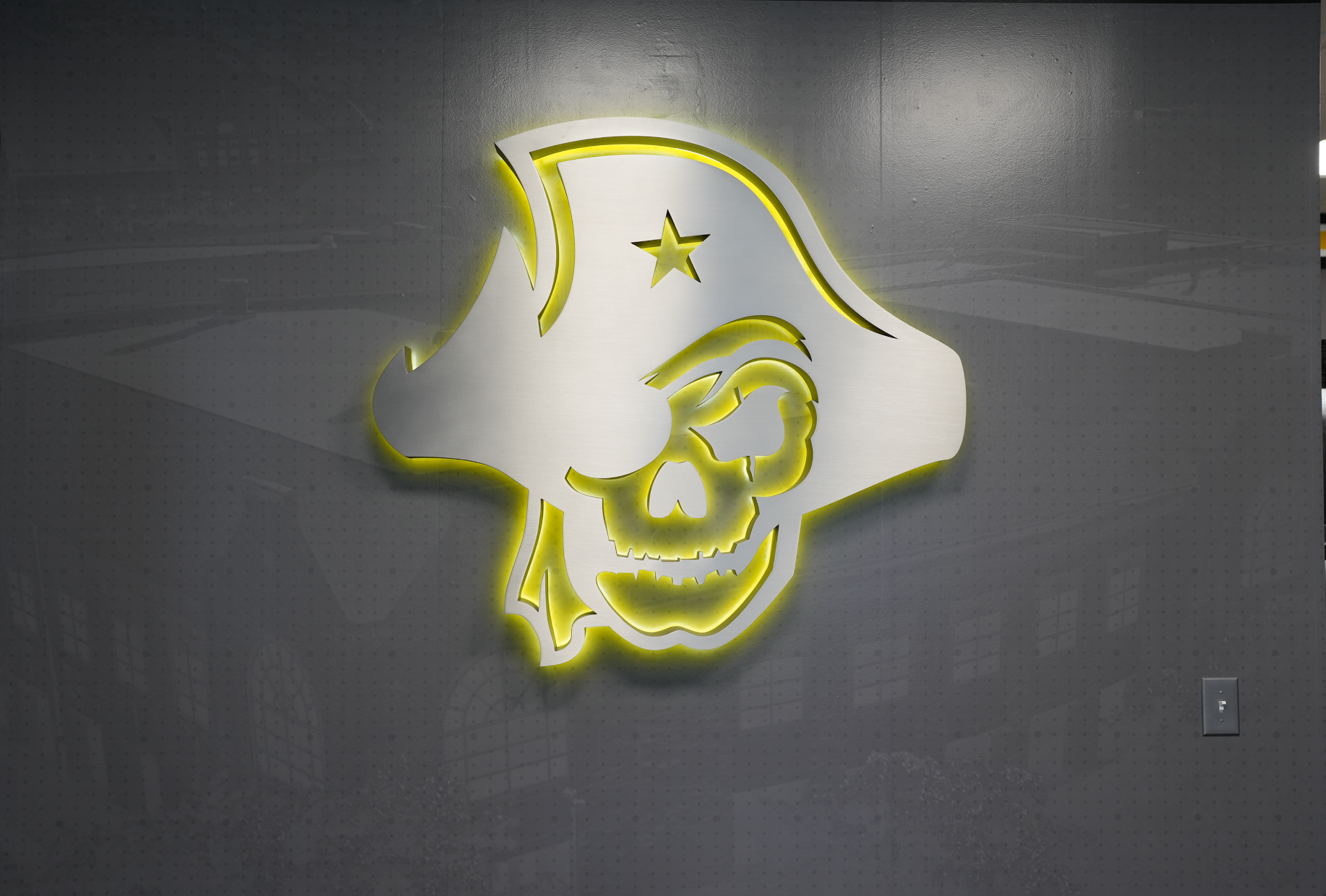
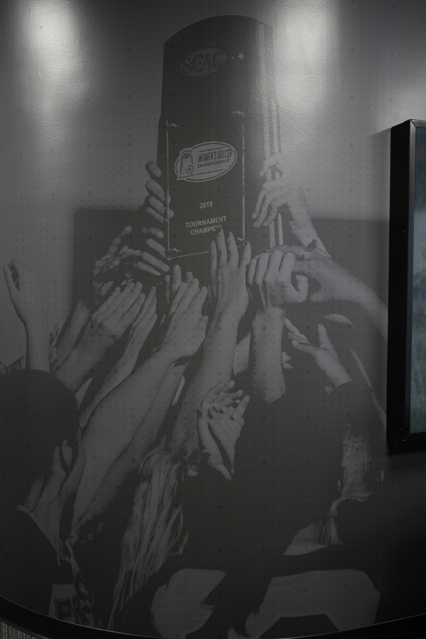
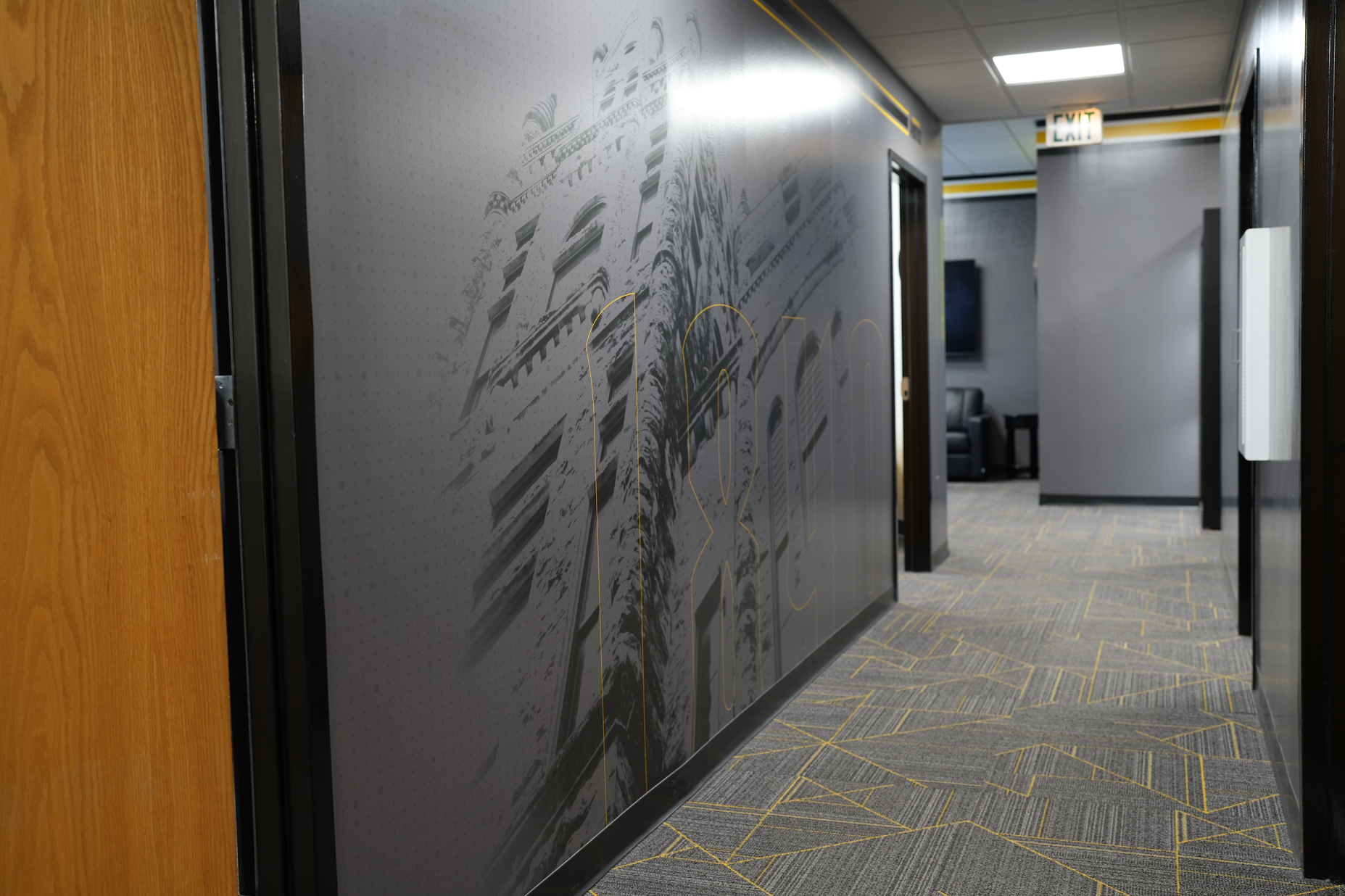
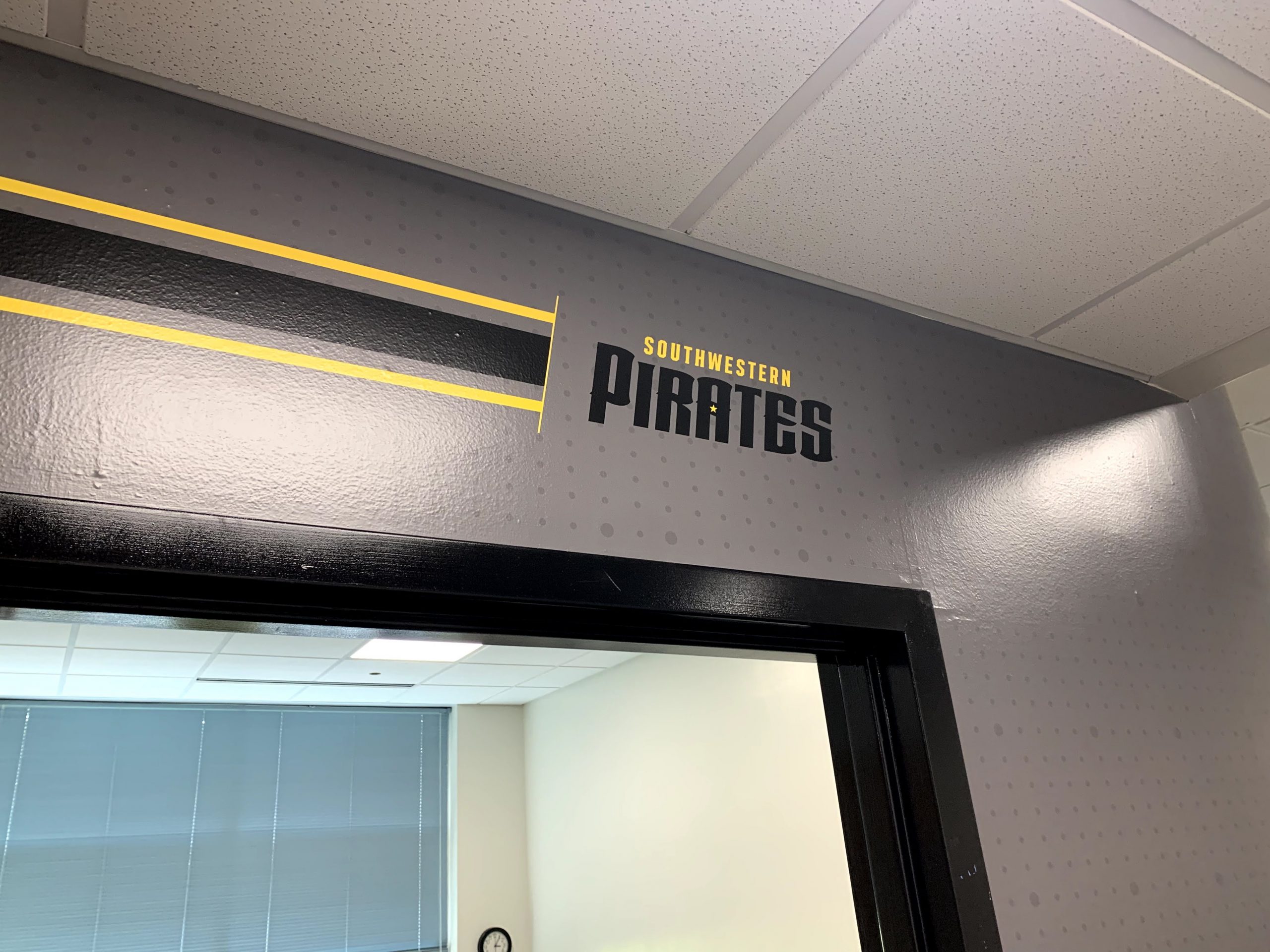
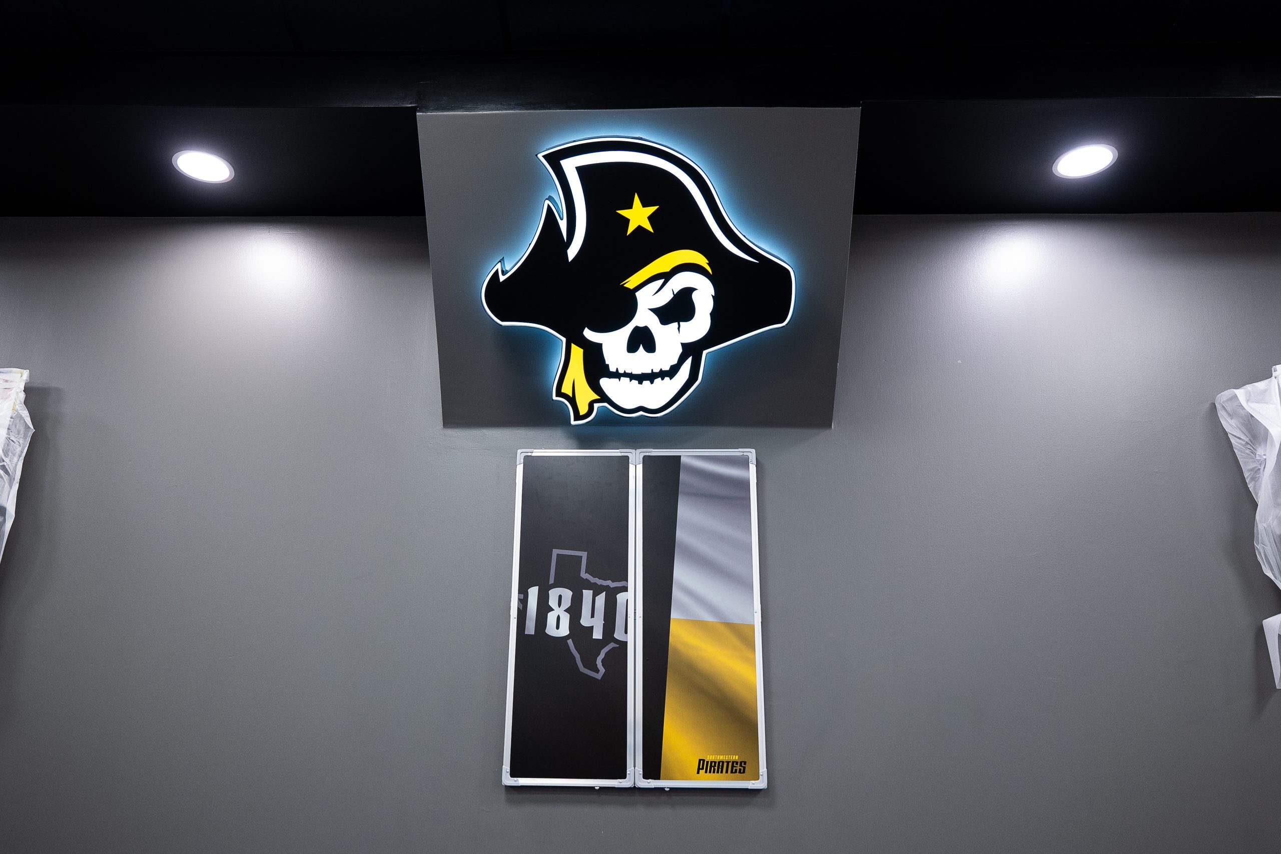
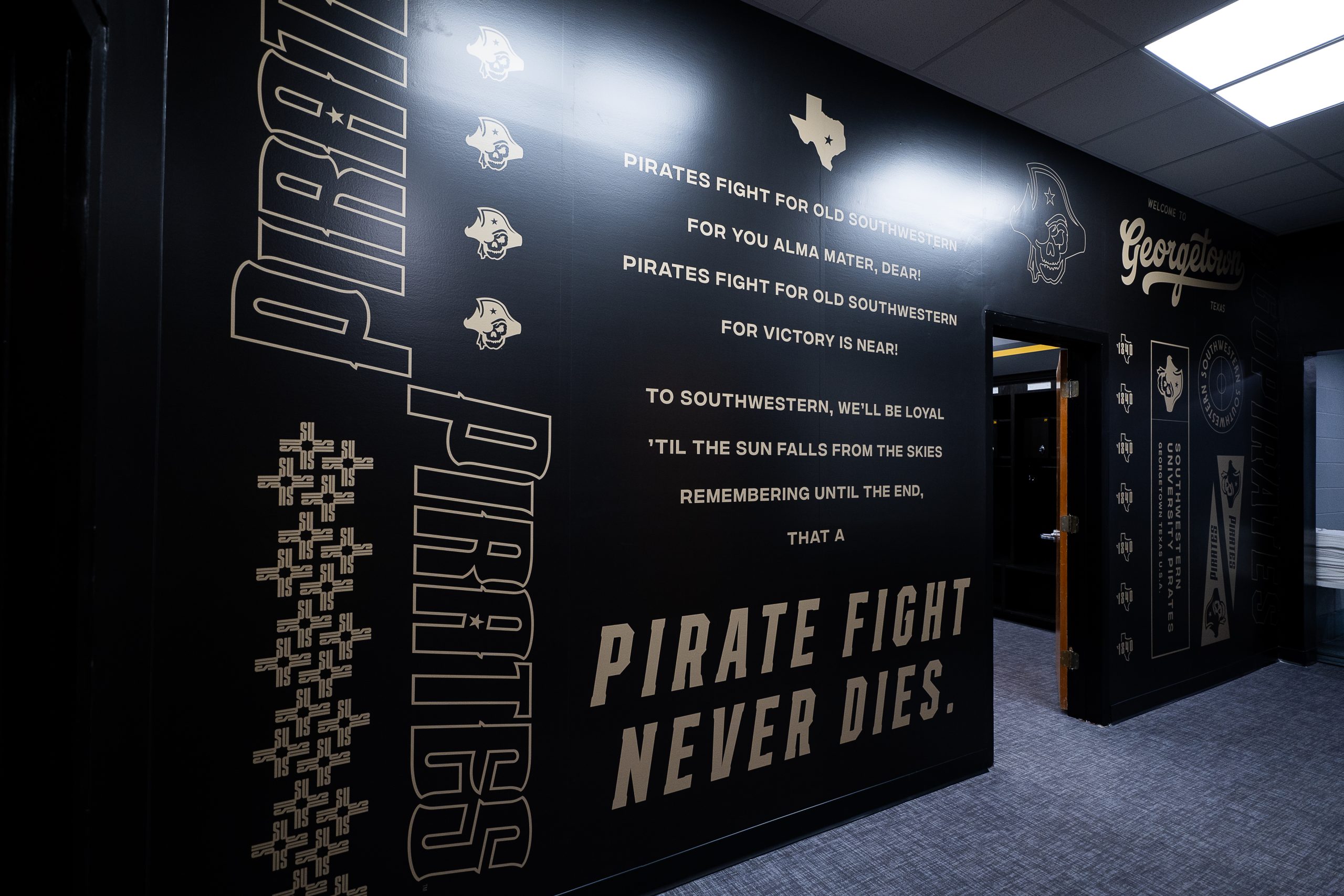
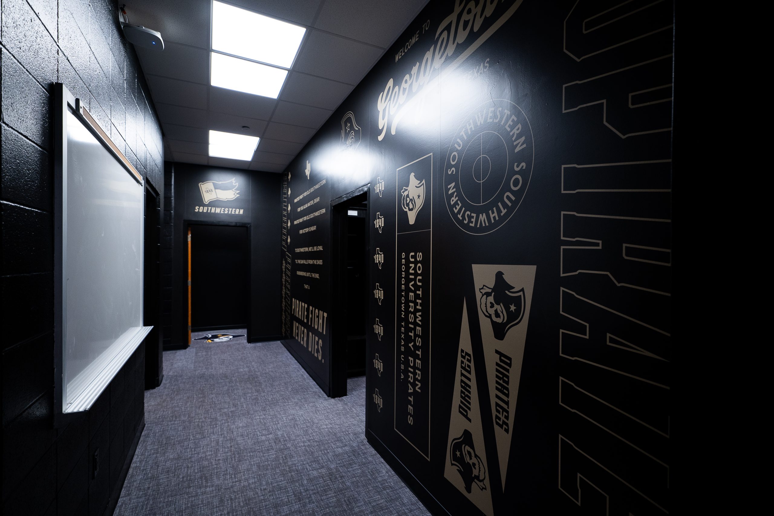
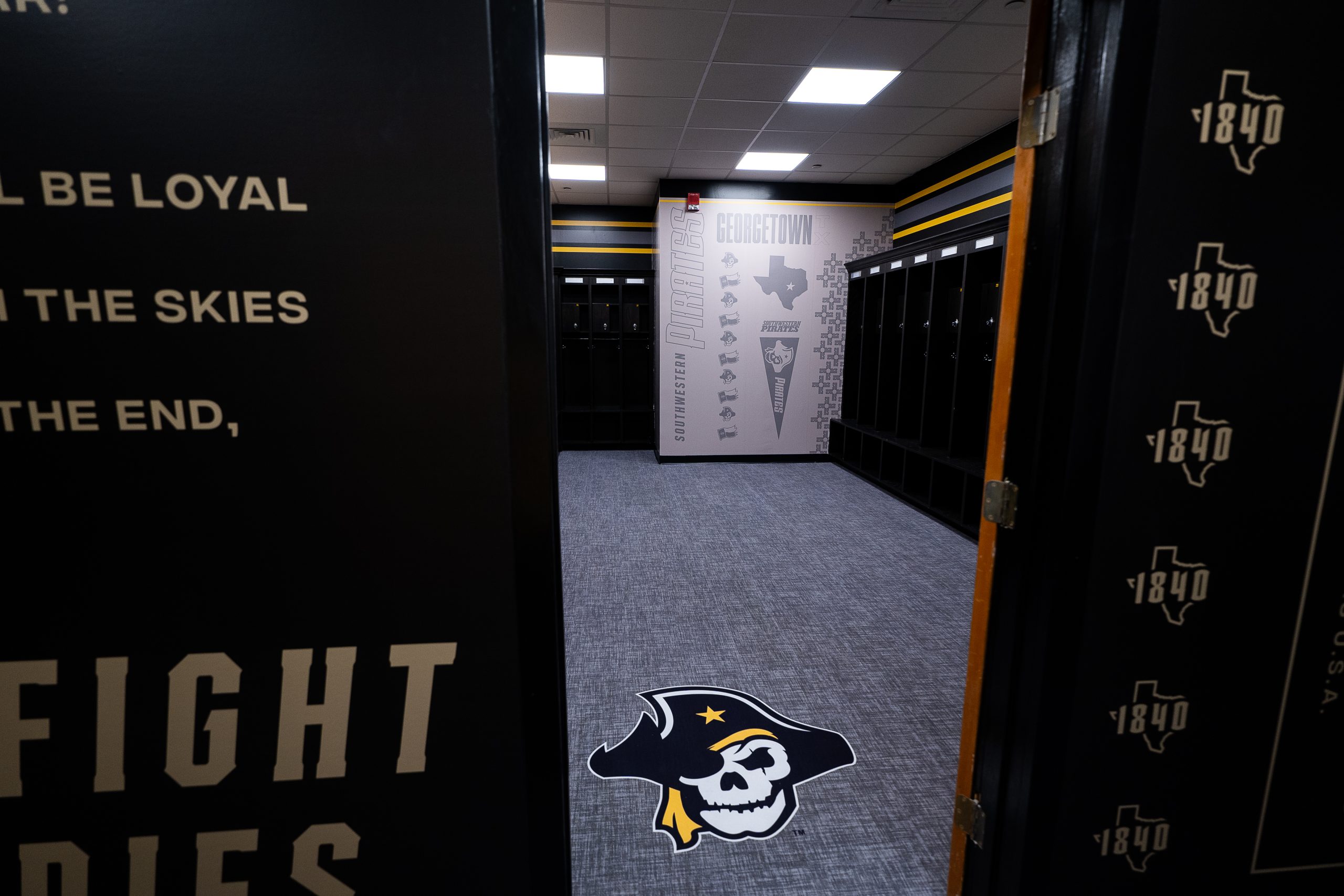
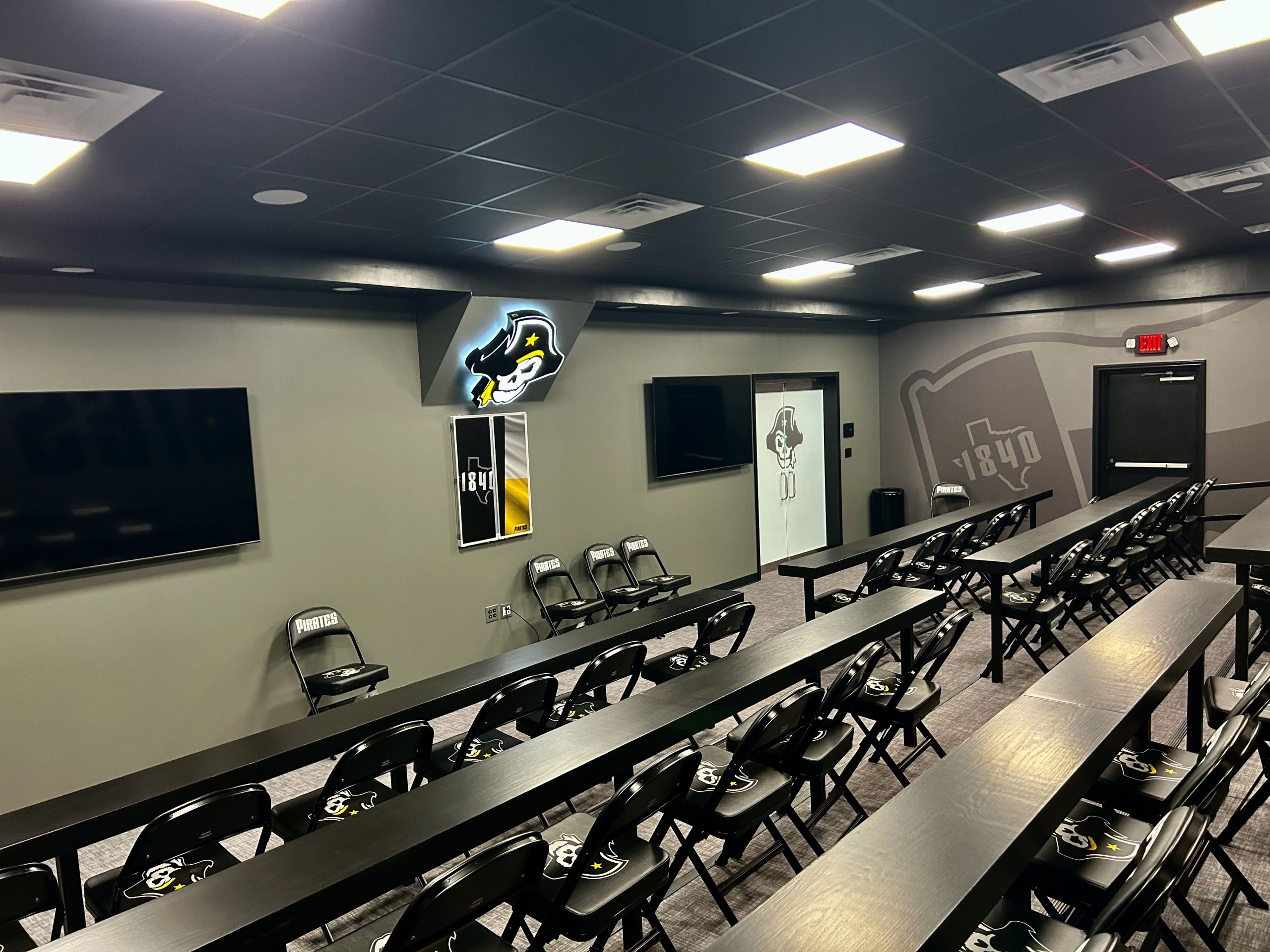
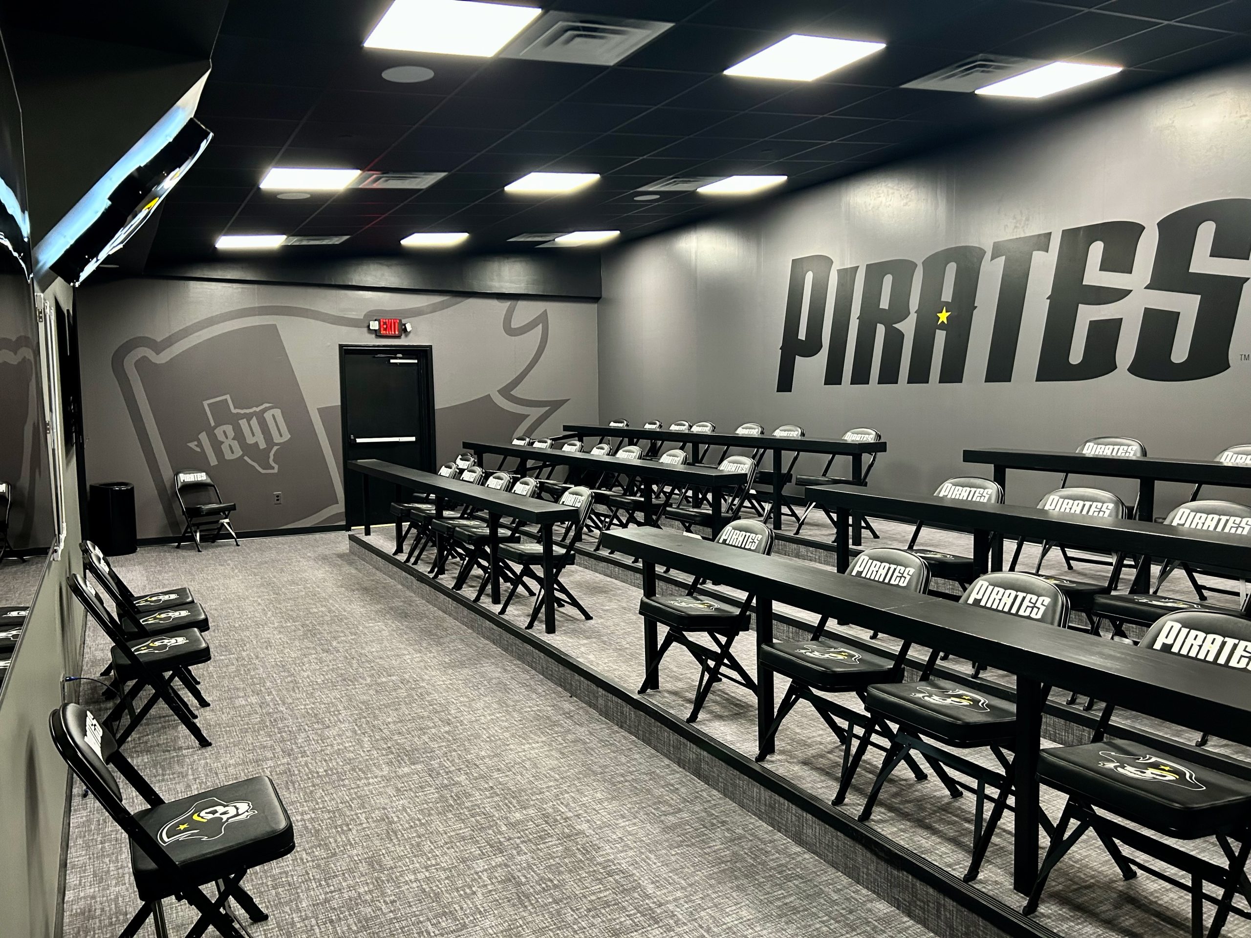
Upon the successful redesign of the Southwestern Pirates athletics logo suite, brand expansion and implementation was up next. The goal was to design engaging and dynamic physical spaces that would lift school pride as well as provide photo opportunities and engagement with recruits who come through on visits. Among the spaces were a main entrance lobby, a team meeting room converted from an old racquetball court, and a new women’s locker room. By nature, pirates are gritty and tough, so a darker look suits the new brand well. Blacks and grays would be foundational, making the familiar yellow of Southwestern even more impactful. The new aesthetic was pulled into the spaces primarily with wall wraps and complementary custom furniture and graphic and textural elements, where appropriate.